The last unit of the semester was tying together all of the future designs back with older designs along with the transformation they have taken as time passed. A lot of criticism was a major issue during this last time period we talked about. Designers are trying to use new materials old looks with new looks. New evolutions of structures are starting to come in effect as well. Johnson wax building has lily pad columns. Criticism is a way for people not to have change when if they took the chance to modernize they would realize it works out for the best. I like these design a lot because it not only changes the norm and starts a new way to think but it actually worked out to support the structure really well. Who would have known support can be a decoration as well. I think it was a gutsy move but we need those to move forward in design and keep the world changing with times. Another change with time was having mechanical near the top instead of the top set aside for view. I also think this was a gutsy move but in my opinion actually is a nice way to look at it. The bottom is for a lot of room and although the top is no longer for views it takes away from mechanical objects near the bottom for everyone to see, at least it is hidden. It may not be convenient for people but overall it’s for the best for cleanliness of the buildings mechanical works. A lot of the last unit was the criticism that is presented as time passed and new designs were appearing up that wasn’t normally seen before. I think the material was the biggest change. Traditional places that would use wood or bricks would start using concrete or other materials that wasn’t normal for that type of style. This in my opinion was the biggest controversy during this new era of revolution in design styles. Another example would be Vietnam War Memorial. It had a lot of controversy in the fact that it wasn’t sufficient enough to commend the men and women who had lost their lives. It was a clean and simple design that had the axis pointing to other major spots in D.C. It didn’t need a lot of detail to it to get its point across. I think another problem with the criticism in this time was that people didn’t realize upfront that language had changed as well. New things told old languages but in a newer more modern way. It got the point across to commend those who had lost their lives without having to be gaudy with tons of detail. A material that would be highly reflective and clean cut and sharp looking was the perfect way to show this. A lot of the last unit was explaining the issues with change. It tied up the past with how it was modernized and how those new designs were viewed in the eyes of others. Change may not always be the best in the beginning but a lot can come out of time and adapting to new ways. I think the last unit was there to open our eyes into going outside of lines to make something new and to not take criticism the wrong way. Not everyone will like what you do but a lot may and time changes a lot of people’s minds. This unit opened my eyes in the way that changing old and making it into new may have a lot of controversy but is the foundation to how changes are made. Try new things, fail, and try again. Design is not a set and stone way. There are rules in a sense that things are done in a certain fashion but that doesn’t limit the possibilities in how you can design.
Thursday, April 28, 2011
Wednesday, April 27, 2011
BP 14 Due April 29
Favorite Place. |
Design influences me in the way I express my own sight on beauty. The way I would design something or the things I like in design are what express my kind of views. My favorite place would be Denver, Colorado. I love this place because of the way a city can be built with the landscape provided. It is almost like a valley where the homes, and buildings are down in the valley and everywhere you look are mountains surrounding you. I love this as design because homes and buildings are built with the stone and tile roof look. I think complements well with the mountain scene. Materials almost try and blend buildings into what a mountain is made of. I love this place also because of the relaxation and innocence it prevails. Denver is almost like its own city away from other because of the exclusion that it has. My favorite space would be my bedroom. I would say my bedroom because this is my chill spot, my space for just me. I have the things in there that make me happy, express my views of design and the things I like most. I have music, pictures and photos, the colors I like, the way I like rooms to be set up in design. It expresses me to the max and it’s a place where I can get away from everything and relax. It’s a space I spend a lot of time in and its all for my comfort. My favorite object would be my iPod. I like the design of how simple and sleek it is to hold so much info. This is my major cool down, stress reliever and I would die without my music. I especially like the design because of the easy access to find songs and have options to benefit the genres I’m listening to. Last but not least my favorite building would have to be the coliseum. I really like the design that started the whole arch and stacking of arches revolution. It is a great design to hold many people for a single event. The 360 view was also a great idea along with stacking to accommodate more people without the need to take more landscape. The arch idea in my opinion makes the building what it is. It was a great way to have an elegante decoration that could benefit the structure as well.
Favorite Object |
Favorite Building |
Favorite Space. Bedroom similar to mine. |
Monday, April 18, 2011
Two Views of Desgn-Extra Assignment Due April 18
Education plays a role in interior design but I dont think it plays a mjaor role. I don’t think you can teach someone the ideas and thoughts that someone might have. The logistics that came with learning from a school and classroom will defiantly help and benefit you, but if you don’t even have the creative thought you will get nowhere. You can help spark ideas in someone but for those who naturally have it can learn the logistics as trial and error until they figure out what works and what does not. It is always beneficial to have education to further your profession but it’s not needed if you are skilled naturally and hard working to figure out the concepts you missed out on in an education. Credentials and experience in a design field are important. Experience more than credentials in my opinion. Not everyone can get on the map as being a top 5 designer in the world. You can be low key and do great work. Today it is who and not what you know. The credentials don’t have to be there for people who know people and for people who are low key for a bigger job need the credentials to proceed with it. Experience in the other hand is very important. If you don’t have experience in the design field you won’t be able to work diligently and create new ideas. Experience builds greatness, the more you know how things will turn out or work for yourself the better you can work. I think taking a holistic approach is the ultimate tool for a designer. If you can understand from the ground up you can understand where certain things can go and work around to compliment the structure. This is probably the most important thing in my eyes. This could really make something great even greater because you worked with the littlest things that people don’t see or realize because there the background of the scene. Life experiences and skills bring a lot to the table for a designer. Knowing knowledge from jobs such as painters, carpenters, etc. can really help benefit a designer. Life skills such as being a mother can benefit a designer into making a nursery. If you’re younger you can maybe help younger couples building a house by relating to the younger age of design. Media in the role of interior design almost makes it seem as though they aren’t really needed anymore. They make people feel as though they can do a lot on their own when really an interior designer is more qualified in more in depth aspects than a person with no background can even think of.
RR13 Due April 18- Criticising Future
Criticising Future
Farnsworth House
Farnsworth House
· Designed by Mies van der Rohe
· Elevated the home because of a nearby river that would flood
· Podium elevated as well with stairs up to the house’s platform
· Two sets of four columns support the roof
· All glass no solid walls
· Two zones- Bathroom/Kitchen as one
· Curtains not originally built for the home but then added for privacy and to keep the sun out
In my opinion this is a very nice home. It is starting a new era of homes that don’t have to have walls. I think that he did this exact style because the area it is in has nothing around it to be self conscious about having your life viewed by others. It is in the middle of trees and fields where it is almost as if you’re living in the nature because of the glass. I think the real criticism is why try this? This is farfetched in trying new styles. People were used to the traditional walls, separate rooms, and privacy. Mies went away from that to create one big open space with all glass to almost make it seem as though you didn’t have anything separating you and nature. Although in reality it is not a comfortable home because of the heat and being in a glass box the overall concept of trying to open up living spaces is going in a direction that could be perfected. In aspect with Eames homes I think they’re both very similar. Eames instead of all glass had some walls added. Glass as a material for a entire house just shows that the structure is sound. The concept of buildings as skeletons and skins the Farnsworth house is all skeleton. BY having glass as a skin it shows the support being sound because glass would not be used to support. That also was starting to be a modern thing showing the skeleton of buildings such as the cast iron and steel buildings where you get see a lot of the foundation and supports. I believe it also has a decorative use to it if they are shown right. No one is used to change. Criticism will be everywhere at all times. How you build upon the criticism and further your designs is where people will realize change and that modernizing is actually a good thing. I think Mies design of this home was a definite good way to start a new way of how to modernize not only will glass but that glass can be walls.
Sunday, April 10, 2011
RR 12 Due April 11 Skyscrapers as new styles
Wrigley Building
Skyscrapers twisting style
· A building of modern engineering with a old wealth and culture feel to it
· Built in 1920s
· Built because there were no major office buildings north of the Chicago river
· The south tower is taller than the north tower
· Built in glazed terra-cotta
· Used the shape of the Giralda tower of Seville's Cathedral combined with French Renaissance details
· Connected with a walkway mid way up the building
· Clock on south tower is 360 view
· Has the most extensive use of Terra- cotta in the world
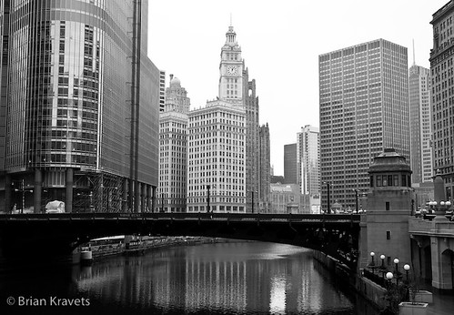
I think that the Wrigley Building is a great way to show the skyscrapers as a change in design. I find it interesting that the Woolworth Building is also built in terra-cotta with a gothic style when the Wrigley Building is built out of the same material but has a French renaissance feel to it. I think this was because the materials for both of the buildings show its old wealth and cultural look to it but can have different styles to show what the purpose is of the building. The Wrigley Building was shaped from the Giralda tower in France. I think this being said the purpose of the building was to express Mr. Wrigley’s Gum Empire as something that will be so massive and well known that the French Cathedral style says that he will be the god of this specific area of gum. The decorations of the French Renaissance were also a nice touch because it brought over a style that the U.S. hasn’t had and could build upon. The Wrigley Building has a north and south tower. The South tower being larger by 9 stories with a 360 degree view a two story clock on top. The idea of this I think was to be the focal point in Chicago. This clock would put the building on the map as important because if you needed the time you would look for the Wrigley Building. This in my opinion was a great way to have your building advertised as being large during the time and getting attention just because of the clock. When relating it to the north tower being smaller I think this was because he didn’t want the tower to take away from the clock. If the north tower was taller it would be hard to see the clock in certain degrees of the building. I really like the walkway that connects in between the towers. I think during this time when it was built this was a huge change in design let alone the skyscraper itself. I think it is a good way to connect the two buildings together to have them linked together as one massive building without being connected side by side.
Showing it in the landscape to show the clock as a major focal point for the towers to be noticed as something diffrent than just two tall buildings. |
BP12 Due April 11
Showing the campus as a whole and the roads lead to bigger buildings and how the roads make it easy to get around. |
When I think of a good design for all the first thing that comes to mind is a college campus. I think that this a good place for all because it is made to accommodate many people. The campus is a good design for all because it can relate to and help out people with different wants and needs. Campuses are usually easy access for people to get around and convenient with certain places that many people gather. For example food and parking are usually very convenient for people to get to quickly. It is a good design for all because it is designed to further your knowledge. That is a design that everyone can benefit from, although people who cannot go to college for certain reasons the design itself it still beneficial for many who can and cannot go. For people who cannot afford to go to school not only can go on a campus to eat but also use their recreational facilities. This example is shown through our campus with Yum Yums and the basketball courts, and tennis courts over on the north side of campus. Campus is for students but also for surrounding people. Campus as a design is great because it was designed to accommodate not only students but surrounding people who live close by. Through examples of our campus it can also show campuses as being a good design because they put the EUC and Café in a center location on campus with roads leading straight towards them. The design was to have easy access to major buildings and areas for large gatherings. Another reason that campuses are a good design for all is because it also creates jobs for people who live by and need a job. They can work in food, cleaning, landscape, and other essentials for maintaining schools. Campus is designed to need workers with the amount of buildings and other available services the campuses provide. Campuses are designed to have many people there 24/7. It is designed to sleep people, have sporting events and accommodate visitors, feed people, educate people, have meetings, have other extra circular activities. It is a great design for all to find something they are interested in or wanting to use the campus for and get something out of it enrolled there or not.
Showing that Yum Yum is on campus and that everyone can benefit. Good design to have outside resturants in the middle of campus on the busiest street. |
Monday, April 4, 2011
RR 11 Due April 4 Frank Lloyd Wrights Modernization
Frank Lloyd Wrights Modernization
· Frank Lloyd Wight’s early work was linked to Morris’s English Arts and Crafts movement
· Believed in embracing the machine
· Tried to emphasize horizontal lines in design
· Was into the Victorian style
· Like the cross shape plan, fireplace being the middle
· Believed in taking up landscape
· Influenced by Japanese style
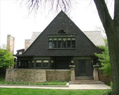
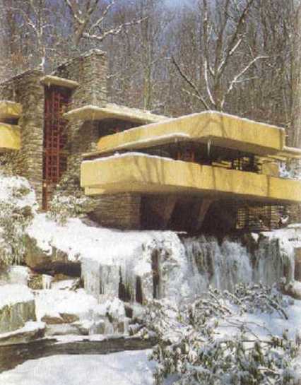
Throughout the reading and the concepts talked upon during class in the past week I think the overall point to get out of this was that Wright was modernizing the suburban architecture. He modernizes architecture in general actually from furniture also. He believed in the shaping of architecture as a cross to have a main focal point within. Mainly a fire place but he started into an open space instead of rooms for each event. Living rooms, dining rooms are open for gathering instead of being closed off. I think Wright was expanding and breaking the rules with trying things that weren’t the norm. Prairie style homes and bootleg homes are definitely not the norm. Art and crafts are starting to become more important. Machines or no machines were the question during this time. New ways of making things stylish and modern was the key movement. I think Wrights new styles helped start something new in to moving ways of building structures that have influences from other regions. I think Wright influenced the style of Victorian and Prairie styles for today more because of his design early in the 20th century. Wrights design to me said that he knew where he got his ideas through the style but had an extra flow to it with his ideas. He didn’t forget the past but he didn’t forget to have the future in there as well. Lloyd wasnt afraid to express his views that broke traditional architecture designs. I think the opening of space was a huge thing. He modernized that in my opinion to have more mutual rooms. In Falling Water this strucutre I feel like he modernized in the way we use natural structures into building great designs around them to complement. The inside used its already rocks and boulders as a way to have furniture/decoration. Just using what the Earth provides us can turn something so little into a famous structure such as Falling Water.
Lloyds home and studio |
Lloyds Falling water plan |
BP11 Due April 6
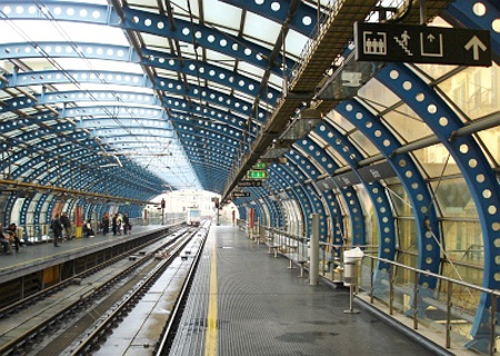
With people in need to modernize I think a lot of help came within the world fairs. The world fairs introduced a lot of things that have been happening around the world that others could share. Population was starting to grow with people by the 20th century. I think the style and design on the Queens House in Greenwich influenced the structure across landscape but not only stretching structures but building ways to get around places underneath. Although this was a bit of time before the beginning of the 20th century I don’t think this idea was forgotten. World fairs in my opinion showed new ways of how the world could be built and designed. This then could bring older styles and ideas such as the Queens house into aspect to start something new to modernize how transportation would be conducted in cities. My modern day place would be the subway stations. I think this was greatly impacted into being built in the 1800s with world fairs expressing new influences on city plans and transportation. This sparked an idea of why not have transportation underground to where the city can be shaped whichever way it wants without having to worry about how people are going to get around. Granted roads are going to be a burden on how the buildings and city can be built but having huge trains and long railways are much more massive than roads and cars. I think this was a great way into modernizing the world. It allowed for transportation to be faster and safer in a sense that a fast huge train has less likely of a chance to crash and hurt people if it’s underground. Another great aspect of it being underground is you can shape the railways and twist and twine the railways whichever way you please. It would be underground buildings and other set objects won’t be a factor. I think there was a need to modernize around the beginning of the 20th century because we are starting to invent bigger and better things where such means need to happen to allow for these inventions to prosper. We have machines to do mass assembly, we have wars where we need heavy artillery, there is a need to have components to compliment where the world was starting to direct itself towards. Design is starting to have new ideas from older times with ideas of people during this time that are experiencing the changes and inventions of new things. Theme parks are a good example because it is starting to become a popular fun event. Back in the older centuries it was a great time for gathering with a few games, and food. Now it is a place where it’s a city within itself to have fun. The design of having this is a direction from world fairs and older designs of having open places for fun and gatherings. I think it was called Disney "WORLD" because it was influenced by world fairs where it’s a world of its own where everyone can come and enjoy the festivities. Everyone wants to go to Disney World. Overall we need to modernize to future the design for tomorrow. New things come and we have to adapt design for these things. But older designs will always have a foot in the door and have reflection in new design. It’s the foundation of how we design our world today
Sunday, April 3, 2011
US 2
Unit Summary 2
In the past unit that we have been studying and critiquing we have learned many concepts and ideas that have had great impact on the way design and architecture has shaped within the years to come. We have learned how rules differ from east to west and how that can lead to people breaking those rules and trying different designs around the world. That being said it relates to the language that was trying to be said by this along with how things are designed to tell stories. Many great ideas and designs have shaped what design is today. Together the rules put man in center, following the rules as a rule, and to maintain the past’s designs. The east was known for mosaic, carpets, shoji panels, and solids reflecting color. I think the east was trying to have a more welcoming feel to it by having elements of warmth such as carpet and the shoji panels which to me are calm and homey. The west on the other hand was into stained glass, stone panels, and chests of drawers. Which reflecting the west in my opinion is more of efficiency to show wealth and power. Stone and stained glass show more of an area to have business or upper class gets together. The languages tied into these all have different meanings based upon location in the world. For example the Queens house in England shows balance and purity. To complement elements the stacking and columns show power and importance. Transitioning from woo woos to structures that take up more of the landscape also show importance and mass. The more it expands the bigger it looks even if it’s not. Elements such as domes, arches, columns are showing the meaning that these places are trying to express. The cathedral in Vienna, Italy has a dome to express that this is the area of mass collaboration and gathering, along with warms colors to show the warmth of Italians. Structures then transition to open spaces like St. Peters square. I think the open spaces were trying to transition in having great strcutures where open space was there greatest focus. The open space was showing its dominance in the landscape that the space was its power. Its power that only they could have. With language there is architecture of happiness. Building structures that make people happy are another issue within this time. To me out of the places we touched upon the city of Venice is an area of happiness. It expresses the love with having a city to its own separated from land by water. They have water ways to get around the city but the architecture being white is welcoming. Churches on the ends of the axis to waterways show there welcoming for people to enter. With the industrial revolution coming to the U.S. many designs have been brought over but tweaked with American influence. For example the Capital Building in D.C. reflects pantheon influence into the building’s entrance. Word fairs are popular around this time to show others the ways in regions of the world where many people don’t get to see. I think this was a great idea to spread culture and ways of life that could help influence others to try new things. For example the New York world fair showed the style of buildings for the future. The skyscraper and newer designs could be now brought back to other areas within the world. I think the major concept of the unit was to show us that breaking the original rules can lead into new designs that make the world happy and willingly to try new things. Coloring outside of the lines is not a bad thing. You have to try new things to possibly make older things even better. The Roman and Greek styles are a never ending design. Although these styles are still around and always will be around people have adapted to using these designs with other designs to make a new look. I think this unit is also showing us a way of the old influencing the new but in a way that speaks on its own without having to tell the meaning behind it.
Sunday, March 27, 2011
RR 10 March 21-25
U.S. Capitol
Design cycle
Design cycle
- Began in 1793
- Many architects because of complex design
- Front modeled by Pantheon
- Broke rules by outside being symmetrical but not inside, broke neo classical design
- Dome was built for visual apperance
- The dome is out of porportion with the building
- Almost resembles a cathedral but the long wings take that affect away
BP 10 Due March 28 Revolutionary Object
Showing the world moving into a direction that could change the world forever, showing a photo that represents a message of revolution. |
Like the dollar bill carrying everyday messages of revolution I believe that pieces of art and photos do this as well. I believe this carries messages of revolution because it shows us where our world and country have come through the many years of joy and heartache. Art and photos expresses the scenery, the problems we faced, and how our country and world have adapted to growing to where we are today. It can tell us what kind of material we had available to us during those times from what the art was made out of. For example fresco paintings show us the materials Michelangelo had to use for painting permanent designs like that in the Sistine Chapel. Not also that but what the stories of Christ and how it could show us the world before. Another example would be moving from a camera with a minute flash time to a fraction of second years after. It just shows the technology and better available materials we had to use. Art and paintings not only show the materials we had and how we grew for years to come but by events. The photographs in history books are a prime example of objects that can show the revolution messages that our world has experienced. A photograph can tell us a lot. It can tell us what happened, what time period it happened, what was available to us during that time, and how people responded and acted. From a design aspect I think the history of art and photographs are what moved us in the direction of how things are done today. Design is always influenced by past to move forward into how the future of design can be manipulated. In other words we look into the past for influence to tweak into how the future and time period if now to make something completely new.
Showing matieral and how it revolutionized. Also telling us what was available during this time and how future dates more became available to document life as we know it today. |
Sunday, March 20, 2011
RR 9 Week of March 14-18 Expansion of language
St. Pauls Cathedral Expansion of Language
Language, and its colonial expansion
· The building is in the shape of a cross with a dome
· The dome is one of the largest in the world
· The blind side story was constructed so that the dome wouldn’t look out of scale
· Used buttresses with the columns for support
· The cathedral is made up of a lot of extras to make other areas match or appear larger
· Paris and Italy were influences for how the columns were set up
The cathedral I thought was a good example of the concepts we talked about in class this week. Starting with colonial expansion it shows expansion from past and future. It has a neo classical design to it with both sides matching which was a past design that expanded throughout the years. It resembles the Capital Building in the U.S. today as well. This structure alone just shows how ideas can be passed on and expanded throughout the world. Stacking of columns has always been an overflow of design ideas throughout the years but it expands to different ways of using them. Although the cathedral stacks them it has a different style in a sense of the bottom stacked on top of it but a smaller scale. Semiotics and language are expressed through this structure as well. To me this cathedral means this is a place where everyone should come and worship. The size of this cathedral shows that it’s dominant and has the room to welcome many people. It has purity with the white material and the dome which is one of the biggest in the world this alone shows its dominance as a place. I think this cathedral is trying to say other cathedrals I am the best and the most elegant for its time. It has the purity of white, it has one of the biggest domes, and it’s stacked with multiple columns and that stretch across the landscape. The cathedral also has good balance with making up scale with the big dome so the rest of the cathedral doesn’t look under scale. Within this structure a good word to describe this would be columns. A sentence would be the columns create patterns and symmetry. A phrase would be made from the columns creating patterns and symmetry that make it the cathedral distinctive to surrounding buildings that give off the high priority persona.
BP 9 March 14-18
Colonial expansion in my opinion is a way to have the best of both sides of the world. It gives people the option of having a structure that normally is seen in a certain area of the world and be able to bring that design to another part of the world. For example Mediterranean style homes. Near beaches and lake there are many homes that have that style and they aren’t on the Mediterranean side of the world. It also gives the ability to add on to a design from another culture in the world and add onto it to fit your region. When talking in our discussion groups we came up with the Chateau de Versailles as our west structure that had an analogy. This structure on colonial expansion to the U.S I think is shown through the White House. Although it’s not exactly imitated I see similar resemblances in them. The roof, the windows, the emphasizes on the front door, and how the windows are in lines across the top and bottom stacked I think all resemble how the Chateau was built. Although the White House may not have even been built upon this idea or look I still think with colonial expansion it brought this idea over to the U.S. and it was used with a tweak of American qualities. Columns are still used with different use as a front door roof entrance unlike the Chateau where it is used for decoration with stacking the two layers of major windows. The window set up is fairly similar and the decorative railings on the top of the roof. Both buildings have purity with light colors where they expand horizontally to show importance on the landscape. Colonial expansion from the U.S. I would have to say would come from the Empire State/Chrysler Building. Today in the eastern world many cities are growing there cities up and not across. I think these two buildings helped expand others to build tall skyscrapers to save room and also to have buildings that showed great importance by its mass. The world today is moving towards building up than across because of population and lack of space. I believe the U.S. had a good influence for bigger cities across the world to build aerodynamic buildings, with sleek exteriors that showed its importance within a city. The new tallest building in the world Burj Khalifa in Dubai shows similar features as the Chrysler Building. Both the tall point of the towers is similar, and the stacking layers upon layers. In Dubai they added on more layers upon layers but its similar to the Chrysler Building.
Comparing the Chrysler and Burj Khalifa design. |
Sunday, March 13, 2011
RR8 March 14: Changing the Norm
Humayun's Tomb: Changing the Norm
· A tomb built for Humayuns place of burial
· Influenced the Taj Mahal’s design
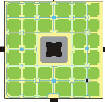
· Sits in the middle of a square garden divided into quadrants
· The quadrants then have smaller squares in them of gardens
· The axis of the compound have water sqaures that have axis to the tomb and walkways
· The dome made up of stone is built right above the tomb
· The interior is matched up with the exterior by red sandstone colored walls on the inside resembling the outside material
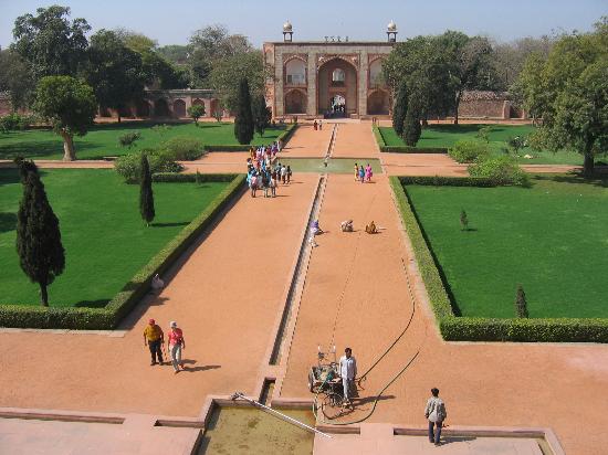
This specific location shows coloring outside the lines well because of the dome. The dome was a western thing and the tomb is located in the east. I think that this is a move across hemisphere because of the language that this one design can tell. The dome shows something important that it sits above. In this case the dome is showing the specific spot where the tomb is at. Sparing no expense also is shown well because of the way the "woo woos" are not being displayed. The rules are being broken by expanding structures across landscapes to make them appear larger and more dominant within the landscape. Not only did they use horizontal design but they stack another layer to show dominance with a dome on top to give it that extra mile of "hey look at me". To make this better they put smaller domes that are stacked above the middle area and surrounded them on the roof. This isn’t the usual designs we have seen within the east. The tomb is also symmetrical. This was a concept we saw allot in the west from the neo-classical ideas. Alot of influence is being distributed and the normal rules between the east and west are now starting to be interchanged and shared as the years go by. The dome and decorative details within the structure are on the front main walkway of the building. The main axis walkway leads right into the front door and although this isn’t something new the adding of water squares in the middle of the walkway is a difference of detail.
Saturday, February 26, 2011
BP7 - Feb. 28 Architecture of Happiness
I think the term architecture of happiness means architecture that is built to serve as a purpose for people. A place to make people feel at home, or to feel the power that the structure is trying to give off through the purpose of it. I think anything can be considered architecture of happiness depending on the person and the feeling they get from seeing certain buildings built the way they are by the materials used, and the look it perceives with the overall language it tries to speak out. The rules tie into the idea of happiness by how the rules were thought of. Each rule has a different concept of how architecture is from thousands of years ago all the way up until today and for years to come. To me each rule is made because those rules are what make these places happy. The fact that man should be placed in the center. That stacks and groves are designed to show a certain personality of the place expressed, and how things are placed to fit and match with order and harmony. These rules are the kind of thing that makes it a happy place to look at. When walking through campus we thought of spaces and places that bring us happiness. I thought of many spaces that would fit but small enough to not be a place. An area that makes me happy is the cafeteria food line space. I like to eat and this space is where I can go to enjoy food and people around me. In a bigger scale the fountain/euc area is a place that brings me happiness on campus. I can eat and walk out to a fountain where many people gather and hang out. I can also walk right in this place to dorms where many of my friends stay. I am also only a few seconds away from another place of food in the Euc. This certain place on campus is where I find happiness because of the different variety of food available along with the main gathering building where I can see many friends. I think that almost anything in this world that is architecture can bring happiness no matter the condition of the structure. It all depends on lives experiences and how you see beauty.
RR7/Feb21-25- How rules can follow happiness
How Rules Can Follow Happiness (Piazza del Campo, Siena.Italy)
Architecture is happiness/east-west rules-conversations/dialouges
· Piazza del Campo is located in Siena, Italy
· During the 13th century one of the most important cities in Italy because of wool industry
· Dominated trades routes with France and Rome
· This plaza is called a campo meaning square it is next to the Piazza and that is a shape of a shell
· A cathedral is on one side, and a town hall on the other
· The campo is the area in the center of Venice
· Palazzo Pubblico goes in hand with the Piazza del campo, both are areas of gathering
· One of Europe’s greatest medieval squares
Showing that man is the center of the gathering area, and its an area for people to gather in the center of the city. |
This picture illustrates the happiness that this architecture shows along with the happiness it brings to the people fo Siena. They can relax and hang out here. It makes them happy. |
The Piazza del Campo and the Palazzo Pubblico are good examples of the concepts we were touching base on in class this week. The concept of east and west rules can relate to these two similar places. Rule six for both east and west are place man at center. I think both of these show this because it was built to sit in the center of the city for people to gather. This rule was shown well because to this day events still go on yearly. In class Patrick related the Ying-Yang as symbol relating to this rule for the east. I believe this symbol also relates to the west because of this center of gathering. My personal opinion I feel as though it is an Italian thing. Italians have always been known for their families and gatherings. This place shows that mind set of Italians quite well. Another rule for both east and west was to strive for harmony. I think this area expresses this rule as well because it looks like it belongs. In an aerial view of the city this open space doesn’t look misplaced. It shows the importance of this area because it fits into the city and has important structures surrounding. For example a cathedral and town hall are surrounding the Piazza. The other concept we talked about this week was architecture of happiness. I believe this area the Piazza is a happy place for the Italians. It is an area that all can gather and enjoy the company of others along with what the city has to offer. The place relating to this area in a bigger scale would be the entire city of Siena. This city and that area especially are the examples of the architecture expressing happiness to Italians. The area where they can all gather as one along with the actually city that they live in is happiness. The last concept we talked about in class that relates to this city is dialogue and conversations. Patrick’s example of this concept was Venice, and how the city talks to people as the city of stone. I think the city of Siena is telling people that Siena is the city warmth. It shows warmth through putting an area in the middle of the city where all can come.
A picture showing how this area passes on the feeling of warmth. |
Sunday, February 20, 2011
BP 6 Regions
Showing the Cathedral and surrounding building to show warm colors from the rooftops. |
In class on Friday our topic for discussion was language and comparing the language of Amiens, and Florence. I think region as a lot to do with how language is expressed and are shown through these two cathedrals. The views and beliefs are different depending on the area it is in. The people affect how the church may have been built, the environment and materials available may be a factor or the type of religion in that area. I feel as though the Florence cathedral had a dome as a place to all come together in one area as a reference to how Italians are. Italians are known for family and collecting for times of fun or worship as a whole. I believe this was built this way because of the region this cathedral was made in. Another example of region would be the color of the city surrounding the cathedral along with the cathedral itself. The roofs on all of this are warm colors. In my opinion it is because it’s near a body of water and on a peninsula which gives it that warm, beach feel. The region can affect many scenarios when building structures. France is a country of more elegance and people who think they are superior to others. I think the cathedral here was built the way it was because of the elegance France is associated with and because of the government. France used to have a King and Queen. I believe the church was built in this time based of the fact that the King and Queen gave it a rich and upper class persona. When you walk up to the cathedral it has a scary, intimidating feel to it in the sense of only the stuck up kind of people would feel comfortable because it suits their life style of big, elaborate, and importance persona. Amiens isn’t as
welcoming as Florence for example. Inside the floors of Amien look like mazes that are not able to get out of. I think this is because the region at the time wanted it to seem that if you were a higher class this wouldn’t intimidate you. France I think fueled of this during the time of King and Queens. On the other hand Italians for a long time have always been referenced to being one and having huge families. I think the cathedral there was built to welcome more people to be able to celebrate worship as one. Region has a lot to do with how not just cathedrals are built but homes, buildings, and other places to gather are built. I think it depends on the people who live there, how the persona of that area is. I believe it depends on how close to mountains,
water, or other natural features these places are.
|
Showing Amiens, and the intimidating entrance. |
Showing the dome of Florence, and a center point of where many can gather. |
RR 6: Feb 14-18 : Why It Is Built The Way It Is
Why It Is Built The Way It Is (Plan of St. Gall)
Coke Can Cathedral/Perspectives
· A 9th century plan for the medieval monastery at St. Gall in Switzerland
· Site is organized into three zones
1) Area for the open population bottom of site
2) Monastery in middle
3) Cemetery, garden, infirmary at the top
· Surrounding the church are buildings special to novices and abbots
· St. Gall is a nave church-meaning it is the central approach to the alter or the main body of the church
· The entire city behind walls is set aside for monks and the areas for essentials for living
The plan of St. Gall I believe was a good example of the concepts we talked about in class. It explains the coke cathedral, regions, and perspectives well. The coke cathedral is shown through this example with how the church was built. It must have been extremely difficult to build such a massive structure in the center of a miniature city back during this time. It was like when we went outside and tried to build our coke cathedrals. It was extremely difficult in terms of finding a foundation that would support such a great structure. It also depended on the region we were in. I was personally Germany while building. We had to towers that needed to be built for our cathedral. St. Gall has two towers at the end of the church that served as two different alters for the church dedicated to St. Michael and Gabriel. During the film we watched showing us the deep insight of how these cathedrals are built, this is a very time consuming project. I believe the church was built in terms of making a very dramatic entrance with the two towers. In terms of entering you had alters either on the left or right. If you had kept walking the church would have been a ways down and the main part of the church would have been shown. St. Gall also shows perspectives well. Friday in class when comparing cathedrals my term was language. I believe St. Galls has a lot of language associated within it. It tells the city that this is the reason this place is what it is. The city is revolved around the church and it tells us that it is important. The two towers on the end tell us that not only is this the spot for religion but the two fingers pointing to heaven and god. In the picture the main door in and out of the city also leads right into the main door for the church. This tells me that if you enter your entering into the house of god, it’s almost as if it is leading you right into his arms.
Subscribe to:
Posts (Atom)