Saturday, February 26, 2011

BP7 - Feb. 28 Architecture of Happiness


I think the term architecture of happiness means architecture that is built to serve as a purpose for people. A place to make people feel at home, or to feel the power that the structure is trying to give off through the purpose of it. I think anything can be considered architecture of happiness depending on the person and the feeling they get from seeing certain buildings built the way they are by the materials used, and the look it perceives with the overall language it tries to speak out. The rules tie into the idea of happiness by how the rules were thought of. Each rule has a different concept of how architecture is from thousands of years ago all the way up until today and for years to come. To me each rule is made because those rules are what make these places happy. The fact that man should be placed in the center.  That stacks and groves are designed to show a certain personality of the place expressed, and how things are placed to fit and match with order and harmony. These rules are the kind of thing that makes it a happy place to look at. When walking through campus we thought of spaces and places that bring us happiness. I thought of many spaces that would fit but small enough to not be a place. An area that makes me happy is the cafeteria food line space. I like to eat and this space is where I can go to enjoy food and people around me. In a bigger scale the fountain/euc area is a place that brings me happiness on campus. I can eat and walk out to a fountain where many people gather and hang out. I can also walk right in this place to dorms where many of my friends stay. I am also only a few seconds away from another place of food in the Euc. This certain place on campus is where I find happiness because of the different variety of food available along with the main gathering building where I can see many friends. I think that almost anything in this world that is architecture can bring happiness no matter the condition of the structure. It all depends on lives experiences and how you see beauty.

RR7/Feb21-25- How rules can follow happiness

How Rules Can Follow Happiness (Piazza del Campo, Siena.Italy)
Architecture is happiness/east-west rules-conversations/dialouges

·         Piazza del Campo is located in Siena, Italy
·         During the 13th century one of the most important cities in Italy because of wool industry
·         Dominated trades routes with France and Rome
·         This plaza is called a campo meaning square it is next to the Piazza and that is a shape of a shell
·         A cathedral is on one side, and a town hall on the other
·         The campo is the area in the center of Venice
·         Palazzo Pubblico goes in hand with the Piazza del campo, both are areas of gathering
·         One of Europe’s greatest medieval squares
Showing that man is the center of the gathering area, and its an area for people to gather in the center of the city.

This picture illustrates the happiness that this
 architecture shows along with the happiness it brings to
the people fo Siena. They can relax and hang out here. It makes them happy.
The Piazza del Campo and the Palazzo Pubblico are good examples of the concepts we were touching base on in class this week. The concept of east and west rules can relate to these two similar places. Rule six for both east and west are place man at center. I think both of these show this because it was built to sit in the center of the city for people to gather. This rule was shown well because to this day events still go on yearly. In class Patrick related the Ying-Yang as symbol relating to this rule for the east. I believe this symbol also relates to the west because of this center of gathering. My personal opinion I feel as though it is an Italian thing. Italians have always been known for their families and gatherings. This place shows that mind set of Italians quite well.  Another rule for both east and west was to strive for harmony. I think this area expresses this rule as well because it looks like it belongs. In an aerial view of the city this open space doesn’t look misplaced. It shows the importance of this area because it fits into the city and has important structures surrounding. For example a cathedral and town hall are surrounding the Piazza. The other concept we talked about this week was architecture of happiness. I believe this area the Piazza is a happy place for the Italians. It is an area that all can gather and enjoy the company of others along with what the city has to offer. The place relating to this area in a bigger scale would be the entire city of Siena. This city and that area especially are the examples of the architecture expressing happiness to Italians. The area where they can all gather as one along with the actually city that they live in is happiness. The last concept we talked about in class that relates to this city is dialogue and conversations. Patrick’s example of this concept was Venice, and how the city talks to people as the city of stone.  I think the city of Siena is telling people that Siena is the city warmth. It shows warmth through putting an area in the middle of the city where all can come. 
A picture showing how this area passes on the feeling of warmth.


Sunday, February 20, 2011

BP 6 Regions


Showing the Cathedral and surrounding
building to show warm colors from the rooftops.

In class on Friday our topic for discussion was language and comparing the language of Amiens, and Florence. I think region as a lot to do with how language is expressed and are shown through these two cathedrals. The views and beliefs are different depending on the area it is in. The people affect how the church may have been built, the environment and materials available may be a factor or the type of religion in that area. I feel as though the Florence cathedral had a dome as a place to all come together in one area as a reference to how Italians are. Italians are known for family and collecting for times of fun or worship as a whole. I believe this was built this way because of the region this cathedral was made in. Another example of region would be the color of the city surrounding the cathedral along with the cathedral itself. The roofs on all of this are warm colors. In my opinion it is because it’s near a body of water and on a peninsula which gives it that warm, beach feel. The region can affect many scenarios when building structures. France is a country of more elegance and people who think they are superior to others. I think the cathedral here was built the way it was because of the elegance France is associated with and because of the government. France used to have a King and Queen. I believe the church was built in this time based of the fact that the King and Queen gave it a rich and upper class persona. When you walk up to the cathedral it has a scary, intimidating feel to it in the sense of only the stuck up kind of people would feel comfortable because it suits their life style of big, elaborate, and importance persona. Amiens isn’t as 
 welcoming as Florence for example. Inside the floors of Amien look like mazes that are not able to get out of. I think this is because the region at the time wanted it to seem that if you were a higher class this wouldn’t intimidate you. France I think fueled of this during the time of King and Queens. On the other hand Italians for a long time have always been referenced to being one and having huge families. I think the cathedral there was built to welcome more people to be able to celebrate worship as one. Region has a lot to do with how not just cathedrals are built but homes, buildings, and other places to gather are built. I think it depends on the people who live there, how the persona of that area is. I believe it depends on how close to mountains,
 water, or other natural features these places are. 


Showing Amiens, and the intimidating entrance.
                                                          
Showing the dome of Florence, and a center point of where many can gather.
 

RR 6: Feb 14-18 : Why It Is Built The Way It Is

Why It Is Built The Way It Is (Plan of St. Gall)

Coke Can Cathedral/Perspectives

·         A 9th century plan for the medieval monastery at St. Gall in Switzerland
·         Site is organized into three zones
1)      Area for the open population bottom of site
2)      Monastery in middle
3)      Cemetery, garden, infirmary at the top

·         Surrounding the church are buildings special to novices and abbots
·         St. Gall is a nave church-meaning it is the central approach to the alter or the main body of the church
·         The entire city behind walls is set aside for monks and the areas for essentials for living

The plan of St. Gall I believe was a good example of the concepts we talked about in class. It explains the coke cathedral, regions, and perspectives well. The coke cathedral is shown through this example with how the church was built. It must have been extremely difficult to build such a massive structure in the center of a miniature city back during this time. It was like when we went outside and tried to build our coke cathedrals. It was extremely difficult in terms of finding a foundation that would support such a great structure. It also depended on the region we were in. I was personally Germany while building. We had to towers that needed to be built for our cathedral. St. Gall has two towers at the end of the church that served as two different alters for the church dedicated to St. Michael and Gabriel. During the film we watched showing us the deep insight of how these cathedrals are built, this is a very time consuming project. I believe the church was built in terms of making a very dramatic entrance with the two towers. In terms of entering you had alters either on the left or right. If you had kept walking the church would have been a ways down and the main part of the church would have been shown. St. Gall also shows perspectives well. Friday in class when comparing cathedrals my term was language. I believe St. Galls has a lot of language associated within it. It tells the city that this is the reason this place is what it is. The city is revolved around the church and it tells us that it is important. The two towers on the end tell us that not only is this the spot for religion but the two fingers pointing to heaven and god. In the picture the main door in and out of the city also leads right into the main door for the church. This tells me that if you enter your entering into the house of god, it’s almost as if it is  leading you right into his arms.

Tuesday, February 15, 2011

US-1

Unit Summary 1

                This past unit we learned a lot of concepts that showed us how some of the earliest structures had great effects on our world today. We touched based on buildings, spaces, objects and places. More concepts are stacks, circles, grouping, and how these were applied to structures. It also showed us why these were built the way they were and how it still exist in our world today. There are many examples to express buildings, spaces, objects, and places. Almost everything you look at in this world today can be related back to one or more of these. One good example of buildings is the structures we use for shelter. Spaces are the spaces we around us like landscape or the space inside of buildings that we use for different reasons. Objects are the things that are present in the spaces or buildings that we are in. Objects are everywhere along with space. Places are those areas where space, buildings, and objects are held. These four concepts are the symbols we refer to with how the world is lived and the things that are on the world for living organisms.  Other concepts that we learned this unit were stacking, grouping, and circles. Stonehenge was a good example of circles because of the way it was designed. The circles were formed to show how the earth revolved with the sunrise and sunset. Stacking is another concept that is shown well through buildings with columns. Columns are a form of ways to stack layers for buildings. The coliseum is a good example because they figured out a way to stack layers to make a valley like structure for events. It was easier to build up then have to find valleys already in the earth. They stacked layers upon layers for seats and other amentias for the coliseum. Columns also did a good job for stacking because it allowed for support to stack upon another layer, but it also gave it an elegant look as well. A good example of grouping is the Forum Romanum. This is a good example because the forum is where a lot of people will gather. To put the important things in the middle and group buildings around that is a good way to gather a lot of traffic flow. Another good example is parking garages. Parking  garages are in the middle of heavily populated areas to park. They group buildings around the garage so that it is convenient. Routes and proximity is another concept we talked about. Rome was a good example of how routes were used. They had a barrier around the land for Rome. Within the walls there were roads at an axis of north, south, east, and west. This was to make it easy to travel within the city. They also put the coliseum close to the city but on the outside because it was so big and important at this time. Form, axis, and materials are also important with all these concepts. The shapes and forms of the buildings are important to how it looks and the purpose of the building. Columns are giving it form as well as the circles that are inside of it to form a focal point. Materials are important because of what the building is made out of. Tile, stone, marble, glass, all of these can tell you what the purpose of the building was and what point the materials are trying to tell you of how the building is perceived to people. And last but not least axis. Axis is pretty important because it almost acts are direction to buildings.  It is almost like a road within to show you where to walk and guides you to certain areas to go. There are a lot of ideas within this unit that are the foundation for how we perceive the world today. Just because it is old doesn’t mean it won’t pass on throughout the years.


Shows grouping of important buildings.


Sunday, February 13, 2011

RR 4 week of Feb. 7-11

Narthex: Hagia Sophia
Glass/Stone/Frozen Music/circles/stacking/axis/arches
·         Shows good use of how stacking by columns building from one floor to the next then to the circle on top with glass all over
·         The glass was meant for the feeling of the dome floating
·         Entire inside is stone, marble, and gold shows the expression on faith in a sense that is a powerful thing
·         It is located in Constantinople and is one of the greatest building in Western hemisphere
·         The dome on top represent a circle very well along with frozen music, It echoes and is made for when speaking to bounce off and come back louder
·         It has a neo classical look as well for the dome area, it is symmetrical on both sides with a atrium connected to the end on one side
·         Axis is represented as well in the middle of the dome there’s a circle and it leads you to an alter on one side and to the atrium on the other and doors to the other two sides. Good use of axis using  a circle as a focal point
·         The circle is enclosed into a square which the main center piece with arches on the four corners of the circle to make the square
I thought that the Hagia Sophia was a great place because it demonstrates a lot of the concepts we talk about it class on a daily basis. It has good representation of circles and how circles are used as the circle of axis and even squares with arches on the side of the circles to form the square. Which I think the arches point the four ways of the axis. Circles and columns are also in this because of the dome. The columns are stacking the layers of the building leading up to the dome on top. I feel if this was more than just a place of worship frozen music would be a great example. This could shape how music was made and played because of the structure and how sound can pass through. It is good for voices and it is a place of worship and a massive place. The dome carries the sounds and echoes them making this place a good area for voices and the music that comes with worship.  

BP 5 Flickr Picture/Poem

A space of value with sweet toned skies
Skies that resemble jazz like feeling
A space of many textures with abnormal emotion
Landscape showing rhythm with beats so cool
A beautiful antique structure showing loneliness and heartache  
Loneliness of the trumpets overpowering the rest of the jazz ensemble
Layers stacked upon layers giving overlooking harmony
A tempo so soft and peace
LOOK! What can you hear?

Sunday, February 6, 2011

RR 3 Week of Jan. 31- Feb.4

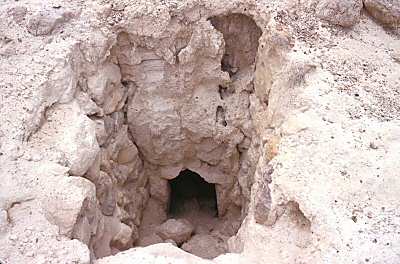
Shaft Tomb at El Arenal
Good example of circles, stacks, and groups.
·         Was the chieftains and their families symbolic center of the society
·         Largest of the shaft tombs between 300 bce and 200 bce
·         Have been destroyed now
·         Circular complex with smaller circular complexes around the main tomb
·         Shaft tombs are about 8 meters deep
·         Shafts are center of the mounds and at the bottom open into a mound
·         Circles were found in groups of two or three
·         Later after 300 BCE came less important and were just huge surface circles with ball courts

I felt as though the shaft tombs showed good examples of circles, stacks, and groups because this is what they are. What is a better example than structures that are exactly this?  From the pictures it looks like the society of people lived relatively close to the tombs. The tombs were in a circle with three circling one big tomb. The thing that caught my attention the most was the shaft in the middle of the tomb. It was almost as if it was a stick pointing to the tombs.  The stacking is represented by the layers of earth that get smaller as it goes up with steps through the middle. It is hard to see these today because most have been destroyed or dug up for artifacts. Grouping was also good example because they grouped the circles together for purpose of the deceased.
Shows a tomb inside of the circle.

BP 3 Feb. 4 field trip

I believe the MHRA had a good example of commodity, firmness, and delight. Although the music people had a better score in delight I feel as though the MHRA did a good job in firmness and commodity. The MHRA had good light for the entrance to with the huge windows surrounding the foyer part of the building. The lighting was natural from shining in from the top which gave it a nice appeal. The materials in the building were not as great like the music people but served purpose and looked pleasing for the human eye for people that are not design majors. The materials in the MHRA were tile floors, with granite or stone imbedded into the tile in certain areas to form a circle that pointed to doors on the opposite side almost like the North Star helping find your way. There was metal that went up the windows almost as columns for structure. The huge glass structures in my opinion are there for help in exiting and entering. The axis always leads you to a door with glass. It allows light to come in as if there were no light in the building you could see some light out the glass to get out. The columns in the foyer of the MHRA were hollow to serve purpose for security fobs but they did their purpose to show a nice elegant feel to the building on the inside. It also uses different color walls to contrast the main lobby into a smaller lobby with a stone like grey. Out of ten I would give the MHRA a 5 in a designers view but in normal students it would serve as a very nice building. The commodity for the MHRA in my opinion scored fairly high. Its function is to serve as a place of learning as well as offices for research. The space was done well with classes near the rear part of the building and the offices at the big foyer opening to give those offices a more elegant feel. Inside the office it was two times nicer than the rest of the building because it serves more of a purpose for business elegance. They had granite table tops and stone in the walls along with carpet. The tiles in the MHRA show axis well I thought too. The roof almost matched the floor tiles and in a way was a road to show you what way to go. The MHRA I thought did a pretty good job as well to show an important structure in our university. It’s on the corner of the busiest street in our campus and the big window entrance is on the corner with steps as if it’s important. Going out of the building doesn’t really lead you into anything really important by the way the entrance was set but it does well with the four corners on the street to lead you up those stairs. The EUC is close by and registration building which makes up for it some. I think the MHRA shows in a good way of where our campus is going. Were growing a lot and putting up a lot of new structures. I think it is showing that we are growing to be a big school and that we are not going to have education buildings but offices that represent what that education in the building is. The MHRA is a building for research and the offices in there are set for that purpose as well. Our campus is growing fast and this building shows by its looks that this is a serious place for education.