Sunday, March 27, 2011

RR 10 March 21-25

U.S. Capitol
Design cycle
  • Began in 1793
  • Many architects because of complex design
  • Front modeled by Pantheon
  • Broke rules by outside being symmetrical but not inside, broke neo classical design
  • Dome was built for visual apperance
  • The dome is out of porportion with the building
  • Almost resembles a cathedral but the long wings take that affect away
I think the U.S. Capitol is a good structure for this week because it shows alot of what we talked about concerning post revolution design and it not being as fluid as pre revolution. In a sense that it has neo classical touches to it from the exterior of being symmetric and massive, but the inside is not. It still expands across landscape for attention and to show power and mass along with sitting up on a hill. It still resembles the Pantheon with the entrance along with columns that stack. The rules that are broken are the proportion of size with the dome compared to the entire building. With talking about pre and post revolution the Capitol shows post with more modern ideas and pre with Pantheon ideas along with a cathedral look for the center and main focal point for the Capitol. I think the language of the Captiol relating to past designs that it resembles is that big, elegant stacking of columns with woo woos that bring attention are still going to cycle for years to come. Breaking the rules of having woo woos and landscape filling buildings can be together on one structure. You dont have to pick between tall or across.

BP 10 Due March 28 Revolutionary Object

Showing the world moving into a direction
that could change the world forever, showing
a photo that represents a message of revolution.
Like the dollar bill carrying everyday messages of revolution I believe that pieces of art and photos do this as well. I believe this carries messages of revolution because it shows us where our world and country have come through the many years of joy and heartache. Art and photos expresses the scenery, the problems we faced, and how our country and world have adapted to growing to where we are today. It can tell us what kind of material we had available to us during those times from what the art was made out of. For example fresco paintings show us the materials Michelangelo had to use for painting permanent designs like that in the Sistine Chapel.  Not also that but what the stories of Christ and how it could show us the world before. Another example would be moving from a camera with a minute flash time to a fraction of second years after. It just shows the technology and better available materials we had to use. Art and paintings not only show the materials we had and how we grew for years to come but by events. The photographs in history books are a prime example of objects that can show the revolution messages that our world has experienced. A photograph can tell us a lot. It can tell us what happened, what time period it happened, what was available to us during that time, and how people responded and acted. From a design aspect I think the history of art and photographs are what moved us in the direction of how things are done today. Design is always influenced by past to move forward into how the future of design can be manipulated. In other words we look into the past for influence to tweak into how the future and time period if now to make something completely new.
Showing matieral and how it revolutionized. Also telling us what was available during this time and how future dates more became available to document life as we know it today.

Sunday, March 20, 2011

RR 9 Week of March 14-18 Expansion of language

St. Pauls Cathedral Expansion of Language
Language, and its colonial expansion

·         The building is in the shape of a cross with a dome
·         The dome is one of the largest in the world
·         The blind side story was constructed so that the dome wouldn’t look out of scale
·         Used buttresses with the columns for support
·         The cathedral is made up of a lot of extras to make other areas match or appear larger
·         Paris and Italy were influences for how the columns were set up
The cathedral I thought was a good example of the concepts we talked about in class this week.  Starting with colonial expansion it shows expansion from past and future. It has a neo classical design to it with both sides matching which was a past design that expanded throughout the years. It resembles the Capital Building in the U.S. today as well. This structure alone just shows how ideas can be passed on and expanded throughout the world. Stacking of columns has always been an overflow of design ideas throughout the years but it expands to different ways of using them. Although the cathedral stacks them it has a different style in a sense of the bottom stacked on top of it but a smaller scale. Semiotics and language are expressed through this structure as well. To me this cathedral means this is a place where everyone should come and worship.  The size of this cathedral shows that it’s dominant and has the room to welcome many people.  It has purity with the white material and the dome which is one of the biggest in the world this alone shows its dominance as a place.  I think this cathedral is trying to say other cathedrals I am the best and the most elegant for its time. It has the purity of white, it has one of the biggest domes, and it’s stacked with multiple columns and that stretch across the landscape.  The cathedral also has good balance with making up scale with the big dome so the rest of the cathedral doesn’t look under scale. Within this structure a good word to describe this would be columns. A sentence would be the columns create patterns and symmetry. A phrase would be made from the columns creating patterns and symmetry that make it the cathedral distinctive to surrounding buildings that give off the high priority persona.

BP 9 March 14-18

Colonial expansion in my opinion is a way to have the best of both sides of the world. It gives people the option of having a structure that normally is seen in a certain area of the world and be able to bring that design to another part of the world. For example Mediterranean style homes. Near beaches and lake there are many homes that have that style and they aren’t on the Mediterranean side of the world. It also gives the ability to add on to a design from another culture in the world and add onto it to fit your region. When talking in our discussion groups we came up with the Chateau de Versailles as our west structure that had an analogy. This structure on colonial expansion to the U.S I think is shown through the White House. Although it’s not exactly imitated I see similar resemblances in them. The roof, the windows, the emphasizes on the front door, and how the windows are in lines across the top and bottom stacked I think all resemble how the Chateau was built. Although the White House may not have even been built upon this idea or look I still think with colonial expansion it brought this idea over to the U.S. and it was used with a tweak of American qualities. Columns are still used with different use as a front door roof entrance unlike the Chateau where it is used for decoration with stacking the two layers of major windows. The window set up is fairly similar and the decorative railings on the top of the roof. Both buildings have purity with light colors where they expand horizontally to show importance on the landscape. Colonial expansion from the U.S.  I would have to say would come from the Empire State/Chrysler Building.  Today in the eastern world many cities are growing there cities up and not across. I think these two buildings helped expand others to build tall skyscrapers to save room and also to have buildings that showed great importance by its mass. The world today is moving towards building up than across because of population and lack of space. I believe the U.S. had a good influence for bigger cities across the world to build aerodynamic buildings, with sleek exteriors that showed its importance within a city. The new tallest building in the world Burj Khalifa in Dubai shows similar features as the Chrysler Building. Both the tall point of the towers is similar, and the stacking layers upon layers. In Dubai they added on more layers upon layers but its similar to the Chrysler Building.
Comparing the Chrysler and Burj Khalifa design.


Sunday, March 13, 2011

RR8 March 14: Changing the Norm

Humayun's Tomb: Changing the Norm

·         A tomb built for Humayuns place of burial
·         Influenced the Taj Mahal’s design
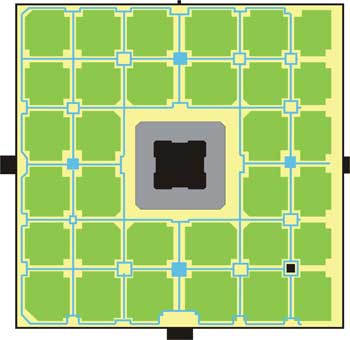
·         Sits in the middle of a square garden divided into quadrants
·         The quadrants then have smaller squares in them of gardens
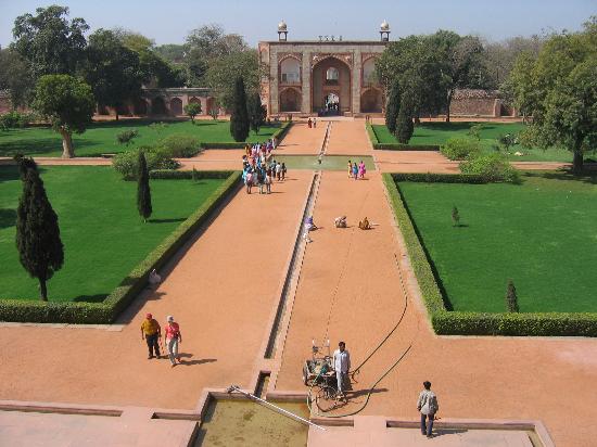
·         The axis of the compound have water sqaures that have axis to the tomb and walkways
·         The dome made up of stone is built right above the tomb
·         The interior is matched up with the exterior by red sandstone colored walls on the inside resembling  the outside material
This specific location shows coloring outside the lines well because of the dome. The dome was a western thing and the tomb is located in the east. I think that this is a move across hemisphere because of the language that this one design can tell. The dome shows something important that it sits above. In this case the dome is showing the specific spot where the tomb is at. Sparing no expense also is shown well because of the way the "woo woos" are not being displayed. The rules are being broken by expanding structures across landscapes to make them appear larger and more dominant within the landscape. Not only did they use horizontal design but they stack another layer to show dominance with a dome on top to give it that extra mile of "hey look at me". To make this better they put smaller domes that are stacked above the middle area and surrounded them on the roof. This isn’t the usual designs we have seen within the east. The tomb is also symmetrical. This was a concept we saw allot in the west from the neo-classical ideas. Alot of influence is being distributed and the normal rules between the east and west are now starting to be interchanged and shared as the years go by. The dome and decorative details within the structure are on the front main walkway of the building. The main axis walkway leads right into the front door and although this isn’t something new the adding of water squares in the middle of the walkway is a difference of detail.